Whether you’re just starting up a small business or you’re looking to rebrand your company and refine your image, a new marketing campaign may be just what you’re looking for. Many larger businesses have internal marketing departments that are responsible for doing much of the writing and design work that goes into producing marketing materials, but some intrepid startup business owners may try to do everything single-handedly. Even if your company employs a marketing department (which can prove to be invaluable at promoting your business), you may be currently contracting your print work with a print and supply company. However, learning how to produce your own marketing materials in-house can save your business money and cut out the time you’d normally spend waiting for your order to be finished. Take control of your business’s future by learning how to make and print your own marketing materials using tools you already have in your office.
Designing a Logo

You don’t necessarily need a graphic logo, but it can certainly help catch eyes and create a brand identity. Even a carefully chosen typeface and lettering style/arrangement can serve as a logo for your business. Typically, a business logo is either symbolic (image with no text), typographic (text with no image), or a combination that incorporates both stylized lettering and a symbolic image.
If you’re going to incorporate a symbolic image, it should convey your brand without raising additional questions. In other words, a consumer should see your logo and immediately recognize the symbol as being representative of your company and the goods or services you provide. Most small businesses will not need a strictly symbolic logo, as these are typically reserved for brands with universal recognition – think of the Apple logo or the Chevrolet logo, for example.
Typographic logos are very common among smaller businesses, as it simply conveys the name or brand of your business using a unique typeface, lettering, and spacing/arrangement. You may be able to design a typographic logo yourself, though hiring a graphic designer is always advisable if you want to create a strong logo for your business. Remember, it can be difficult to rebrand yourself once customers have come to recognize a given logo, so it’s always best to invest a little more time and money into getting it done right the first time.
Combination logos are very common among small businesses, though this type of logo will most likely require the help of a graphic designer. You’ll need someone who can create a logo you will be satisfied with so that you don’t have to rework your business’s image a year or two down the line. Again, it’s worth remembering that this is effectively the face of your business that potential customers will see before ever interacting with you or your employees, so getting the right work is crucial at this stage.
Choose carefully when you’re hiring a graphic designer for your business. Ask to see their portfolio to get a sense of the type of work they’ve done in the past and what their current design aesthetics are. Be open and honest about what you’re looking for. If you make them guess what you want, you’ll end up having a very frustrating back-and-forth discussion that may not be very productive. Don’t just go for the designer who is asking for the lowest payment – actually take the time to find the right person with the right style to make your vision a reality.
Choosing a Typeface

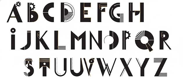
Whether you’re designing a typographic logo or a combination logo, you’ll need a strong font to catch a potential customer’s attention. Font is simply the combination of the typeface you choose (for example, Times New Roman, Calibri, etc.) in the style and size that best meets your vision for a good logo. Different typefaces (and their ensuing font designs) convey different things about your business. For example, some typefaces suggest creativity, playfulness, or even eccentricity. Other typefaces suggest a more regimented, well-ordered way of doing things. In this example, neither choice is inherently wrong – it’s just a matter of what you want to convey. A daycare, for example, may have better luck using a logo that looks fun and playful. An accounting or tax firm may prefer a more structured, “orderly” impression, and may therefore choose more of a basic, no-frills typeface.
- Typefaces are typically organized into several categories:
- serif – with little accented lines at the ends of certain letters; typically associated with traditional or timeless designs
- sans-serif – without any accented lines; often associated with more modern designs
- script – designed to look like it was written by hand, often (though not necessarily) with loops and curves for added flare; may imitate cursive or print lettering
- display – typically an unusual typeface that’s chosen to catch a customer’s eye without being too practical for any long-form writing
- Some common typeface styles with serif lettering include Garamond, Miller, Minion, and Times New Roman.
- Common sans-serif typefaces include Avenir, Brandon Grotesque, Gotham, and Proxima Nova.
- Some frequently used script typefaces include Hummingbird, Paris Serif, Populaire, and Thirsty.
- Some examples of commonly used display typeface choices include Allegro, Broadway, Chiller, and Stencil.
- Go with what’s easy to read over what you think looks “the best.” While your tastes may be refined, they won’t mean much if a customer has a hard time reading your logo and isn’t willing to decipher the strange lettering you’ve chosen.
Adjusting Your Font
Once you’ve got a good typeface chosen, you’ll want to fine-tune its appearance. Bear in mind that some fonts look better on paper than on a digital screen and vice versa. You may need to make slight adjustments so that a logo that looks good on your business card will still look good when someone Googles your business on their smartphone.
- Tracking refers to the spacing inserted between words, while kerning is the spacing between individual letters within a word. Inappropriate tracking choices can make words appear to blend together, while inappropriate kerning choices can make one word appear to be broken up into two or more words.
- You can make adjustments to your logo’s spacing by using editing software like Adobe Photoshop, Adobe InDesign, or Microsoft Publisher.
- As a good test to measure the legibility of your chosen typeface and spacing, try typing a capital letter “I” (I), a lowercase letter “L” (l), and a numeral “one” (1). If you can’t tell the difference, your customers won’t be able to either. Don’t forget to do a sample print with these three characters to assess legibility both on screen and on paper.
- You can combine two or more fonts within the same logo if their differences are subtle. You don’t want your logo to appear jarring, but you also want to catch a reader’s eye. To this end, some designers recommend using one serif typeface and one sans-serif typeface – for example, using a sans-serif heading to grab someone’s attention and a serif subscript or body text to make the words “flow” into one another naturally.
- Try out a few different typefaces and their corresponding font adjustments until you arrive at a logo design that’s perfect for your brand.
Using the Right Printer

Remember that not all printers were created for the same purposes. Some printers excel at producing impressive graphic designs while others work best at producing text documents or black-and-white images. If you want a way to produce fast, inexpensive print work in large quantities, you may want to use a laser printer. However, if your logo or any other part of your marketing materials rely on detailed photo images, you may benefit from spending more money to use an inkjet printer. Most professional photograph printers and graphic designers use inkjet printers, but that doesn’t mean you can’t get high-quality results from a reputable laser printer.
Consider whether you want to use pigmented inks or dye-based inks. Dye-based products tend to be cheaper and often have more vivid color tones, but they also tend to fade more quickly than pigment inks. That being said, a brochure or business card won’t exactly be sitting in direct sunlight for prolonged periods of time, so you can probably get away with using dye-based ink for your marketing materials.
The Canon PIXMA iP8720 inkjet printer is an affordable option for at-home inkjet printing that will yield professional-quality images and documents. Many designers use this printer professionally and give it high marks for its ability to capture the essence of any photograph or image.
Brother HL-L8350CDW printers offer high-quality photo prints with the convenient high page yields of a laser printer. If you need to produce a lot of copies of your marketing materials, this laser printer may be more cost effective than an inkjet printer.
Printing Your Materials
Once you’ve finished designing your logo, printing out your marketing materials will be comparatively easy. What format you choose to print in is up to you, though it never hurts to have multiple types of marketing materials (so long as it is cost effective to do so).
- To print a brochure, make sure you use a design program that can accommodate a trifold pamphlet. You’ll probably want landscape (horizontal) printing, and you’ll need to utilize double-sided (or duplex) printing in order to make your brochure more appealing and easy to read. If your printer cannot do double-sided printing automatically, you’ll need to print a stack on one single side, then turn the paper 180 degrees (counterclockwise) with the printed side facing up. When you’re finished, use a ruler to ensure straight edges in all your folds.
- Printing a flyer is fairly simple since it’s a single page document. Just design the layout of your logo, add any text you want to include, and after making the necessary spatial adjustments, print it out as you would any other typed document.
- To print business cards, use appropriate paper. You can purchase perforated business card sheets at most paper supply stores, which will make it easier to print and separate your cards. Then check your word processing program (like Microsoft Word or Apple Pages) for a business card or label printing option. Some versions of popular word processing programs come with templates that make designing and printing business cards quick and easy. Just be sure your computer doesn’t try to print one card per page – you may need to configure your printer’s settings to accommodate however many cards your business card sheet will hold.
- Always do a test print on one single brochure/business card/etc. before you print out the entire stack. Putting the paper in wrong or having a design flaw may not be immediately evident until you’ve got a hundred unusable copies on your hands.

